#8088 Design changes to Discussions
Hello, after various iterations of the designs I think this one is the best option that matches the current design of the forge.
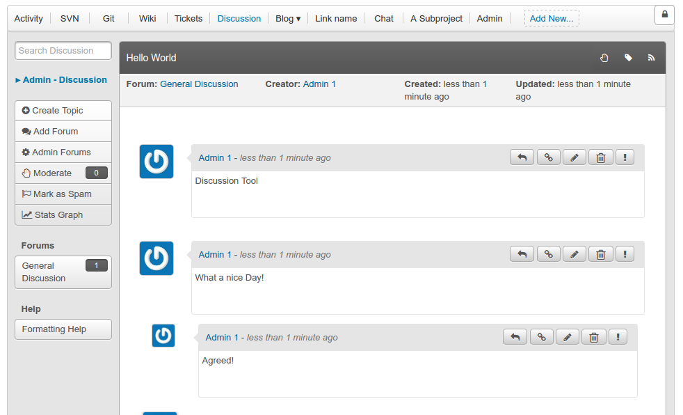
In this design, I have added a toolbar inside the header so that all the information and actions relating to a comment are isolated inside that specific bubble. Also, hopefully the indentation between replies is more intuitive now.
I have added two screenshots, one having more pronounced buttons and one having sleeker buttons.
Please give feedback and suggest further changes.
Source tree: https://forge-allura.apache.org/u/rhnvrm/allura/ci/rhnvrm/discussion/style-changes/~/tree/

Diff:
I like this a lot. The new layout gives more width for the content, which is very important. The user's name has more available width too, which is good (on the current layout if your name is too long it gets cut off). And the style looks more like a conversation which I think will be nice.
I think the sleeker buttons are better since there will be many of them on big discussions, we don't want the buttons to stand out too much. Don't want them to distraction from the conversation.